
Making Online Shopping a Breeze
Breeze
Timeline
January - May 2022
Role
Web Designer, Animation
Team
Innovative Design at USC
Breeze is a universal online shopping extension that allows users to checkout from their
favorite stores in one place with one click. Working with a team of three at Innovative Design,
we designed a one-page website for Breeze that would effectively serve as the
main converting platform to download the extension from the Chrome Store.

Overview
Breeze is a Chrome extension that allows users to checkout from multiple e-commerce sites in one place
with one click. They are looking for a clean, sleek, and fun one-page website that can:
1. Effectively communicate and excite users about the unique features of Breeze and how it works
2. Serve as the main converting platform to download Breeze from the Chrome Store with
multiple points of conversion throughout the page
3. Be accessible to all users, using the principles of accessible design
Research
Target Users
Breeze aims to be accessible to all online shoppers and has defined the following customer personas:
The Leisure Shopper
Breeze's "save for later" function
is perfect for those who love to virtual window shop without
actually purchasing.
The Shopaholic
Say goodbye to endless cluttered tabs! Breeze helps online shopping enthusiasts save time and
checkout from multiple stores
at lighting speed.
The Busy Mom
For someone who is always busy, time is money. Breeze allows users to see all previous orders and tracking codes, so no more digging through thousands of emails to find out when orders will arrive.
Competitive Analysis
Our team analyzed sites of various e-commerce extensions to determine features to include/exclude,
and to effectively tell the brand story while delivering a unique yet accessible user experience.
Here are a few of the competitors that we analyzed:


Here is what we discovered and chose to apply to Breeze:
We were inspired by the clear call to action buttons and the engaging animations on the Carrot site.
We decided to steer away from the addition of distracting elements, whether that is the use of borders (Carrot)
or too many unnecessary tabs (Honey), keeping only the most essential functions for easy navigation.
The end goal would be a webpage that informs visitors about Breeze and its features, and converts them to download the extension.
Ideation
Low-Fidelity Wireframes
Following extensive research, my team and I began the design process by first creating low fidelity drafts.
I was responsible for the header section and the animation that would go on it.
The client had already defined the site content and structure, which included "What is Breeze," "How it works," customer testimonies, retail partnerships and multiple call to action buttons throughout the page.

Mid-Fidelity Drafts
We moved ahead with mid-fidelity versions of the webpage, addressing additional client requests
and needs as they came up, including changes in copywriting, the addition and removal of functions/buttons,
as well as finalizing a visual design system for Breeze.

Design System
Before proceeding to the high-fidelity draft, we adapted the
existing design guide into a more consistent and accessibility-centered visual system.

Final Deliverables
The final webpage, complete with stylized visuals, animations and responsiveness, was built out on Wix.

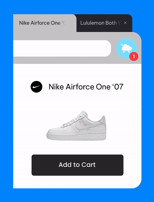
Custom animation
As part of the header section, I created an animation to help visualize how the Breeze extension
would allow users to conveniently checkout across multiple online stores in one go.

Points of Conversion
In creating a webpage that would serve as the main converting platform for Breeze,
multiple call to action buttons were used throughout the page, including in the sticky header,
to direct users to the waitlist and ultimately, to the Chrome Store after the product is finalized.


Key Takeaways
Designing for Accessibility and Inclusion
In crafting a product navigable for all,
our team kept in mind the importance of accessible design principles regarding color, spacing and typography when developing
the visual design system.
The end product was one that accommodated users of and beyond our target personas, particularly those who struggle with poor vision.
Working with Clients
Working with clients meant that additional requests and feedback arose from time to time.
I learned that presenting concepts to clients early and often in the process was crucial in making sure that we addressed their needs while, more importantly, being clear and transparent in communicating the limitations we have as designers and of our designs.
Teamwork is everything!
I am grateful for my talented teammates (Ashley, Erina and Romir), as we constantly bounced ideas
off of each other and inspired one another with our unique, individual sets of skills and insights.
We were a team that worked hard and played hard!
Here are some moments captured from our work-and-cafe hopping sessions!


